|
|
Post by dray on Mar 10, 2007 23:44:01 GMT -5
I'm going to dump those painting piccies here as I do them!  (Fa)  (KTFE)  (Werdnari)  Finished Sarah!  |
|
|
|
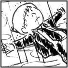
Post by dray on Mar 12, 2007 23:10:13 GMT -5
Aaand another.  |
|
|
|
Post by werdnari on Mar 13, 2007 2:48:43 GMT -5
yikes! Color has definately given Agate a bit of a creepy look that I didn't think was there before! XD Hopefully he doesn't freak out the baby!  |
|
|
|
Post by dray on Mar 19, 2007 20:21:53 GMT -5
 Kin  Red >.<" Hopefully the next ones will turn out better. |
|
|
|
Post by kinrrataiyath on Mar 20, 2007 1:38:29 GMT -5
Eeeeee! So cool! Thank you Dray! |
|
Zero
Free Runner
 You're not a killer. That's why you're so good at it.
Posts: 156
|
Post by Zero on Mar 20, 2007 15:40:52 GMT -5
Wow. Those are pretty cool looking. The smoke from Red's cig is awesome. Kinda still on the fence about the bright white for clothes but that doesn't stop them from being awesome. The creepy Agate part is true too, hopefully that's a bit of what you were going for.
|
|
Simplish
Free Runner
Zombies ate my neighbors!
Posts: 192
|
Post by Simplish on Mar 20, 2007 19:19:41 GMT -5
These are very nice. Gotta agree with Zero on the clothes. It makes them look like evulz cultists in my opinion. But, still f*cking awesome.
|
|
|
|
Post by Red Dawson on Mar 27, 2007 12:55:04 GMT -5
I hadn't gotten around to commenting on the images - they look terrific. Having seen an example of preliminary sketch to final output I have to say that everything is pulled together nicely. The colors really help the images pop, bringing in more dimension than that seen in just the line art and they work together nicely. In my stuff, I try to remove any guidelines I used when structuring the image but I believe that having them present, along with the stroke style of the colors, really helps bring a certain feel to the images - I'd like to say a reconstructed deconstruction in a sense.
The hues are very subtle, with the only exceptions being the starkness of the white clothing and the occassional bright colors (like KTFE's hair or the speckling of Agate's scar tissue). I know these extreme aspects are what's on most people's mind; I think it works quite well - with the stoicness of the poses, a masking of the emotions, even the handling of the fingers and hands with their emaciated elongations (one of the details I like the most), I get the impression of stained glass artwork you would find in a cathedral. The characters are attributed a saint or martyr-like peaceful pose, an idealic interpretation when compared to the miseries their lives have endured.
I could not choose a favorite pic from the current bunch, but I can point out things I thought worked best in each of them:
Fa: Compared to most, her's has the most pastel-like approach which is emphasized by the darkness around her. One of the things I liked the most was the slight glance to the side and the way the mouth was treated - it makes you wonder what is on her mind and how she feels about it. With the coloration being one of the lightest and combined by the facial details, I get the impression of an individual that has been worn down, a faded impression of her former self, yet someone that has not given up (seen in the direction of glance and the slight lifting of the corner of her mouth) and has much to look forward to if she keeps pushing herself. The way the hands are clasped helps identify her as a thinker plus can also represent a closed door, one who keeps things hidden for her own reasons.
KTFE: Of all the images, her outfit has a color other than white. The thing that works the best is that it is just a subtle addition of color, I'd almost would have liked to seen the same effect on the others. On the topic of color, her hair is also the most vibrant (second only to Sarah's). With its red hue being so pronounced and it hinted more in her face, you've made the color representative of the woman, which helps drive home her nickname but offers something else. Red has many definitions and I think that is good based on the background descriptions for her and her current state. When I see red I picture a strong emotional state (love, anger, etc), and to place that color on her with a peaceful contenance helps define an inner turmoil.
Werdnari: Another individual with a slight shift to the glance; with his eye covered by his hair, it implies a guarded individual - someone with something that they wish not to share with others yet the facial expression has a kindness to it that softens the implication. I think the eyebrows help push that. The detailing on the shirt is a bit more pronounced, which I think helps much like KTFE's off-color helps her compostition. I think if I had to point out a weak spot it would be on the coloration of the hand - out of all the pieces, the colors present there are blended the most and I think, because of this, it loses a bit of the rich dimensionality that I mentioned previously.
Sarah: One of my favorite poses, the one thing I like most about the colorization is the choice of aquamarine/teal. You see hints of the color in several of the pieces, but its boldness in use for this image really compliments the stark white outfit. The cheekbones, nose, and chin, have a stronger blush on them with definative highlights stated, emphasizing the youthfulness of the character. Again we see a face partial concealed by hair, which brings home the sheltered mindset of the individual
Agate: I believe this to be the best Agate image I have sen so far. I would attribute that to how the colors state the scarring more than the line art. The multiple 'flesh' hues chosen really helps emphasize the battered physique, as does the blues that youe see in the Sarah pic. The eye set, being rounded and relatively small, are brought forward by the coice of blue and hints to an internal struggle despite the calmness of facial expression and pose. Overall the character's 'damaged' state gave you a great opportunity to play with a larger palette for his skin and I think it was pulled together nicely.
Kin: The thing that sticks out the most for me is the prop and how it is used with the pose and facial expression. The way the broken glasses are held with the general pose (arm behind the back, straight cut to the neckline of the shirt), you get a very sophisticated and educated silouette of the woman. With the fact that the glasses are broken and her facial expression, which is the most emotional of the group in my opinion (I believe that out of all the women, the lines by her eyes are the most emphasized and is the only one with a hint of purple on the lower lids), portrays the image of a broken shell; the fascade is still up but it has cracked, hinting to instability underneath.
Red: I feel biased in describing this due to my relationship with the character but I'll try to be as non-biased as posible. I agree with Simplish, the smoke/cigarette effect is at the top when it comes to what works with this image. Having a hint of orange on the shirt really enforces the alternative light source without becoming to overbearing. The smoke trail and the way the hand is positioned is very fluid and relaxed which makes an interesting contrast to the straightness of the rest of the figure. Another example of this is in the clothing. Although more squared off, you get a softness in the subtle curves of the lines and, although the face has a blank pokerface style to it, the eye and brow hidden under the hair hint to internal pathos.
That's my 2 cents (plus tax). I am looking forward to seeing more of the crew done up; keep up the good work. Once things ease down for me a bit, I may also do a series of group sketches as well.
|
|
|
|
Post by dray on Mar 27, 2007 16:33:38 GMT -5
First of all, thank you for such in depth commentary and compliments! Reading all of that made me smile. Reading through all of that was fun because it has a feel of putting puzzle pieces together, linking imagery to all the words we've been putting down since this board came together. Much like with the wood-carving explanations, there's an element of story-weaving in this that I enjoyed. The ego-stroking helped, but then I'm biased, of course. If you got a chance to do some group-sketches, I think that would be really, really cool.  ' You've got a refined, professional style and I think people would be squiggly with happy to see their chars drawn out by you. X3 I know that I would be! Thanks again. :3 I appreciate your words and the time you took to write 'em out! |
|
zpansven
Free Runner
Karen Howard
Posts: 144
|
Post by zpansven on Mar 27, 2007 20:34:31 GMT -5
Very nicely done, Dray  Brush-tip markers right? I love the depth they can give ones art... |
|
|
|
Post by dray on Mar 27, 2007 20:39:32 GMT -5
Nah, a mix of watered down acrylics or watercolours (in Red's picture, since that's all I had on me!) I was just using a fat brush so it's all chunky. X3 Thanks!
|
|
|
|
Post by Marmalade Boy on Mar 28, 2007 2:16:57 GMT -5
Time for me to leave a nice comment!
There isn't really much I can say that hasn't already been said by the other Cosway-Folk, but your art is really wonderful! Keep it up!
Just a small question; Are you doing Art for A-Level?
|
|
|
|
Post by dray on Mar 28, 2007 10:43:15 GMT -5
A-Level? O.o'? What's that?
|
|
Drake Austin
Free Runner
THROW THE AXE INTO ITS HEAD!!!!
Posts: 210
|
Post by Drake Austin on Mar 28, 2007 13:09:40 GMT -5
Ahh good old A levels. A levels are done in Britain...and maybe just England I'm not sure.
In order to get into university...you have to do some A levels.They are mostly done when people are 17- 18.
However I believe that you are older then that Dray...and in a university course or something? I'm not sure how things work in America.
PS: Like everyone else says...wonderful pictures.You had better be aiming for some form of job involving Art.
|
|
zpansven
Free Runner
Karen Howard
Posts: 144
|
Post by zpansven on Mar 29, 2007 0:54:38 GMT -5
Ahh. The watered-down paints reminded me of my favorite brush-tipped pens... Excellent still, seeing as I can't paint worth a hoot LOL
|
|


 ' You've got a refined, professional style and I think people would be squiggly with happy to see their chars drawn out by you. X3 I know that I would be!